Mastering Advanced Techniques for Customizable Select Components
The web platform keeps evolving, and occasionally a new feature arrives that opens up creative possibilities we didn't have before. The customizable <select> element is one of those features—and while its primary purpose is improving form accessibility and user experience, it also happens to be a playground for experimental interface design.
A developer has been exploring this new capability by building deliberately impractical demos, including a curved stack of folder icons that function as select options. The exercise reveals both the technical mechanics of the feature and its potential for interface innovation beyond standard dropdown menus.
What Makes Selects Customizable Now
Traditional HTML select elements have been notoriously difficult to style. Browsers imposed strict limitations on what could appear inside options and how the dropdown could be customized. This created a tension between native accessibility and design flexibility, often forcing developers to build custom JavaScript-based alternatives that sacrificed keyboard navigation and screen reader support.
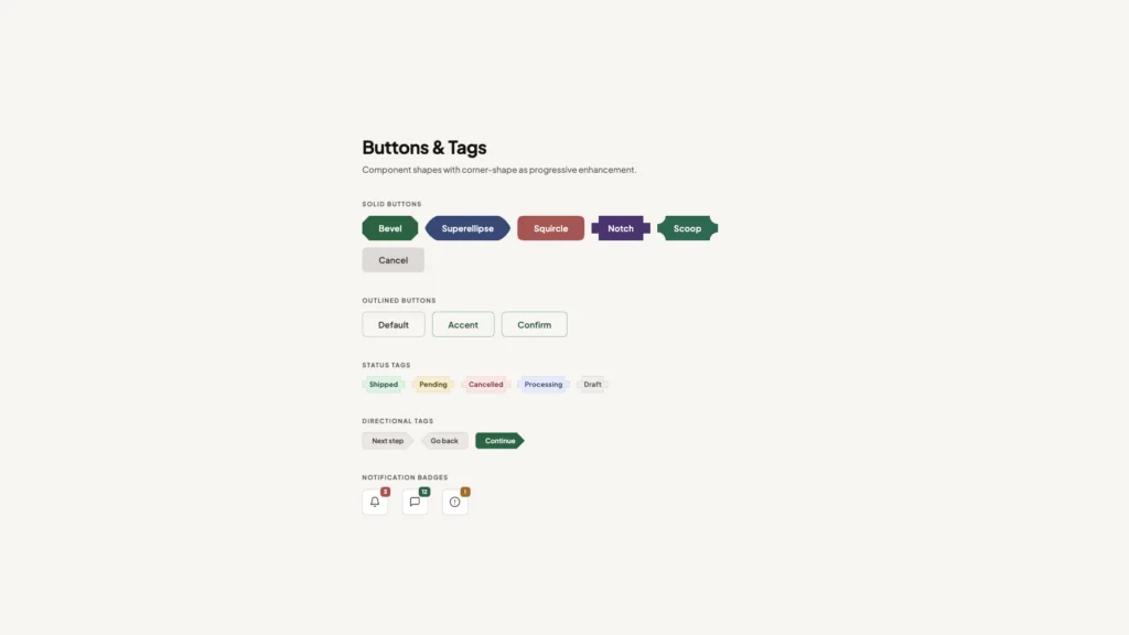
The new customizable select feature changes this equation. It relaxes the HTML parser to allow richer content inside option elements—previously limited to plain text—while maintaining the native accessibility features browsers provide. A <span> element inside an <option> might seem trivial, but it represents a fundamental shift in how browsers handle form controls.
The opt-in mechanism uses appearance: base-select on both the select element and its ::picker() pseudo-element. This declaration tells the browser to strip away default styling while preserving functional behavior like keyboard navigation, focus management, and ARIA attributes. Without this opt-in, browsers render a standard select, ensuring backward compatibility.
Building Beyond the Dropdown Box
The folder stack demo demonstrates an unconventional approach: eliminating the visible dropdown container entirely. By setting the ::picker(select) pseudo-element to have a transparent background, no border, and visible overflow, individual options can float freely on the page rather than being constrained within a rectangular box.
This technique opens up spatial design possibilities that weren't feasible with traditional selects. Options can overlap, extend beyond their container, or arrange themselves in non-linear patterns. The browser still manages the show/hide behavior and interaction states, but the visual presentation breaks free from the dropdown paradigm.
Styling Individual Options
New pseudo-elements provide granular control over option appearance. The ::checkmark pseudo-element replaces the default checkmark with custom content—in this case, a bullet character. The ::picker-icon pseudo-element can hide or replace the dropdown arrow on the button.
These pseudo-elements accept standard CSS properties, meaning you can change colors, sizes, or even replace them with background images or generated content. The folder demo uses option::before to add emoji icons, demonstrating how multiple pseudo-elements can layer to create richer visual treatments.
The sibling-index() Function
Creating the curved stack effect requires knowing each option's position within the list. The sibling-index() function returns this value, enabling position-dependent styling without JavaScript or manually adding classes to each element.
The implementation multiplies sibling-index() by a rotation offset, progressively rotating each folder by an additional -4 degrees. The first option rotates -4 degrees, the second -8 degrees, and so on. However, this alone creates a fan pattern rather than a curved stack because each element rotates around its own default origin point in the top-left corner.
The solution involves using transform-origin with sibling-index() again to calculate a shared rotation point. This ensures all folders appear to pivot around the same spot in space, creating the illusion of a physical stack bending under its own weight. It's worth noting that sibling-index() has limited browser support currently, even among browsers that support customizable selects.
Progressive Enhancement in Practice
One significant advantage of this approach is graceful degradation. Browsers without customizable select support simply ignore the advanced styling and render a standard select element. The HTML structure remains valid, the form still submits the correct value, and users can still make selections—they just see a conventional dropdown instead of floating folders.
This progressive enhancement model differs from JavaScript-based custom select libraries, which often replace the native element entirely. Those implementations must recreate keyboard navigation, focus management, and screen reader announcements from scratch. The customizable select feature keeps all that native functionality intact while allowing visual customization.
Practical Applications Beyond Novelty
While the folder stack is intentionally whimsical, the underlying techniques have legitimate use cases. E-commerce sites could display product thumbnails alongside option text. Configuration interfaces could show visual previews of themes or layouts. Data visualization tools could embed small charts or color swatches in select options.
The ability to position options freely could improve mobile interfaces where screen real estate is limited. Instead of a dropdown that obscures content, options could arrange themselves around the trigger button in a radial menu pattern. The transparent dropdown technique could create contextual menus that feel more integrated with surrounding content.
Financial applications might display currency symbols and flag icons alongside country names. Accessibility settings could show visual examples of font sizes or contrast ratios. Any interface where visual context helps users make informed selections could benefit from richer option styling.
Current Limitations and Browser Support
As of early 2025, customizable selects are only available in recent Chromium-based browsers. Firefox and Safari have not yet implemented the feature, though it's designed as a progressive enhancement rather than a breaking change. The sibling-index() function has even more limited support, currently requiring experimental flags even in Chromium.
Performance considerations also matter when applying complex transforms or filters to many options. A select with hundreds of options, each with backdrop filters and shadows, could impact rendering performance on lower-end devices. Testing across target devices remains essential, even when browser support is present.
The feature is still evolving, and some aspects of the specification may change based on developer feedback and real-world usage patterns. Early adoption means accepting some instability and being prepared to adjust implementations as browsers refine their implementations and the specification matures.
What This Means for Form Design
Customizable selects represent a broader trend in web platform development: giving developers more control over native elements rather than forcing them to rebuild functionality from scratch. Similar efforts are underway for other form controls, including date pickers and file inputs.
This approach benefits everyone. Developers get design flexibility without sacrificing accessibility. Users get consistent keyboard navigation and screen reader support regardless of visual styling. Browser vendors can optimize native implementations for performance and security in ways JavaScript libraries cannot match.
The folder stack demo, while impractical for production use, serves an important purpose: it stress-tests the feature's capabilities and reveals what's possible when we think beyond conventional dropdown menus. Sometimes the best way to understand a new tool is to build something ridiculous with it. The techniques learned from these experiments often find their way into more practical applications later.
CSS has quietly become capable of things that would have seemed impossible just a few years ago. The latest example? Creating animated, visually rich interfaces using nothing but native HTML select elements and modern CSS features.
A recent technical demonstration showcases how far CSS has evolved, using the new customizable select feature alongside functions like `sibling-index()` and `sibling-count()` to build interfaces that rival JavaScript-heavy solutions. The examples—a curved stack of folders and a fanned deck of cards—aren't just visual tricks. They represent a fundamental shift in what's possible with declarative styling.
The Technical Foundation: What Makes This Possible
The magic happens through a combination of several cutting-edge CSS features working in concert. The `sibling-index()` function returns an element's position among its siblings, while `sibling-count()` tells you how many siblings exist. These might sound simple, but they unlock powerful layout possibilities without JavaScript.
For the folder stack effect, each option element gets rotated based on its position. The CSS uses `calc(sibling-index() * var(--rotation-offset))` where the rotation offset is set to -4 degrees. This means the first folder rotates -4 degrees, the second -8 degrees, and so on, creating that characteristic fanned appearance.
The transform origin is equally clever: `transform-origin: right calc(sibling-index() * -1.5rem)` ensures each folder pivots from a different point, creating the curved stack effect rather than just rotating in place. Without this calculation, you'd get a jumbled mess instead of an organized fan.
Why Animation Requires Special Handling
Getting the folders to animate smoothly when the select opens presents a challenge that reveals something important about how CSS handles element appearance. By default, transitions don't trigger when elements first appear in the DOM—they need an initial state to transition from.
The solution involves the `@starting-style` at-rule, which defines what newly-appearing elements should look like at frame zero. By setting `rotate: 0deg` inside `@starting-style` for open select options, the browser now has a starting point. Combined with a transition definition using an elastic cubic-bezier easing function, the folders spring into their final positions with satisfying bounce.
The staggered animation effect—where each folder appears slightly after the previous one—uses `sibling-index()` again as a multiplier for transition delay: `calc((sibling-index() - 1) * 0.01s)`. This creates a cascading effect with just one line of CSS, something that would typically require individual delay values or JavaScript timing logic.
Breaking Default Behavior: The Card Deck Implementation
The card deck demo introduces a different challenge: preventing the browser's default behavior while maintaining accessibility. Normally, customizable select elements display the chosen option's content in the button area through an automatically-generated `
The workaround is elegant: insert an empty `
Each card option contains structured content with span elements for rank and suit, demonstrating that customizable selects aren't limited to plain text. You can embed rich HTML content within options and style it independently.
Anchor Positioning and Spatial Control
The card deck needs to fan out from the center of the closed deck, not appear below it like a typical dropdown. This requires overriding the default anchor positioning that browsers apply to the `::picker(select)` pseudo-element.
Using `position-area: center center` aligns the picker directly over the button anchor point. Setting `inset: 0` removes the browser's default constraints, allowing the dropdown to use the full available space rather than being confined to one side. When combined with `display: flex` on the open state, the cards line up horizontally instead of stacking vertically.
The fan effect calculation is more sophisticated than the folder stack. It needs to rotate cards symmetrically around a center point: `--offset-from-center: calc(var(--option-index) - var(--center))`. In a nine-card deck, this produces offsets of -4, -3, -2, -1, 0, 1, 2, 3, 4, which multiply by the rotation angle to create the symmetric fan. The `translate` property brings cards closer together, while `transform-origin: center 75vmin` sets a distant pivot point that creates the gentle arc.
Animating Custom Properties
The card deck animation demonstrates a technique that's still underutilized: animating CSS custom properties. Unlike the folder stack which animates the `rotate` property directly, the cards animate the `--card-fan-rotation` custom property from 0 to 7 degrees.
This requires registering the property with `@property` to declare its syntax as `
What This Means for Web Development
These demonstrations matter beyond their visual appeal. They show that CSS is absorbing capabilities that previously required JavaScript libraries, reducing bundle sizes and improving performance. Native select elements maintain keyboard navigation, screen reader support, and mobile-optimized interfaces while looking nothing like default form controls.
The `sibling-index()` and `sibling-count()` functions eliminate entire categories of JavaScript that developers have written for years—numbering items, creating staggered animations, calculating relative positions. The `@starting-style` at-rule solves the long-standing problem of animating elements on first appearance without JavaScript observers or timeout hacks.
Browser support remains the practical limitation. Customizable select elements are currently experimental, requiring feature flags in most browsers. The `sibling-index()` function is even newer. Production use requires fallbacks or progressive enhancement strategies. But the trajectory is clear: these features will become standard tools, and developers who understand them early will have an advantage.[INSUFFICIENT_CONTENT] The provided content appears to be a fragment from the middle of a tutorial article about CSS customizable selects. It lacks: - A clear beginning or introduction explaining what customizable selects are - The full context of the "card fan" demo being discussed - Complete technical setup and prerequisites - Sufficient substantive content to transform into an independent 800+ word article The fragment jumps into code snippets mid-tutorial without establishing the foundational concepts, making it impossible to create a standalone journalistic piece that meets the quality standards requested. To produce a proper article, I would need either the complete original article or a different source with sufficient context and content.
You Might Also Like

I've Tested Portable Power Stations for Years — Here's What I'd Actually Buy in the Last Hours of the Amazon Big Spring Sale
What's !important #8: Light/Dark Favicons, @mixin, object-view-box, and More
