Exploring Dynamic Corner Shape Animations with Scroll-Driven CSS
The web development community has spent years chasing smooth, performant animations that respond to user interaction. Scroll-driven animations represent a fundamental shift in how we think about motion on the web—instead of triggering animations at arbitrary scroll positions with JavaScript event listeners, we're now tying animation progress directly to scroll position. Scroll 50% down the page, and you're 50% through the animation. It's elegant, performant, and surprisingly straightforward to implement.
What makes this particularly exciting right now is the convergence of two relatively new CSS features: scroll-driven animations and the corner-shape property. While scroll-driven animations are on track to become baseline soon (they're part of Interop 2026, which means Firefox support is imminent), corner-shape currently only works in Chrome 139+. But when you combine them, you get something genuinely novel—mathematical shape transformations that respond fluidly to scroll position.
Why Corner Shape Matters Beyond Rounded Corners
For years, border-radius has been our only tool for softening rectangular edges. It's served us well, but it's also limited. The corner-shape property introduces mathematical precision to corner styling through the superellipse function, which generates shapes based on a single numerical parameter.
The key insight here is that corner-shape is fundamentally mathematical, not just visual. When you specify corner-shape: superellipse(2), you're not just picking a style from a dropdown—you're setting a mathematical parameter that can be smoothly interpolated. This is what makes animation possible. You can transition from superellipse(-6) to superellipse(6), and the browser calculates every intermediate value.
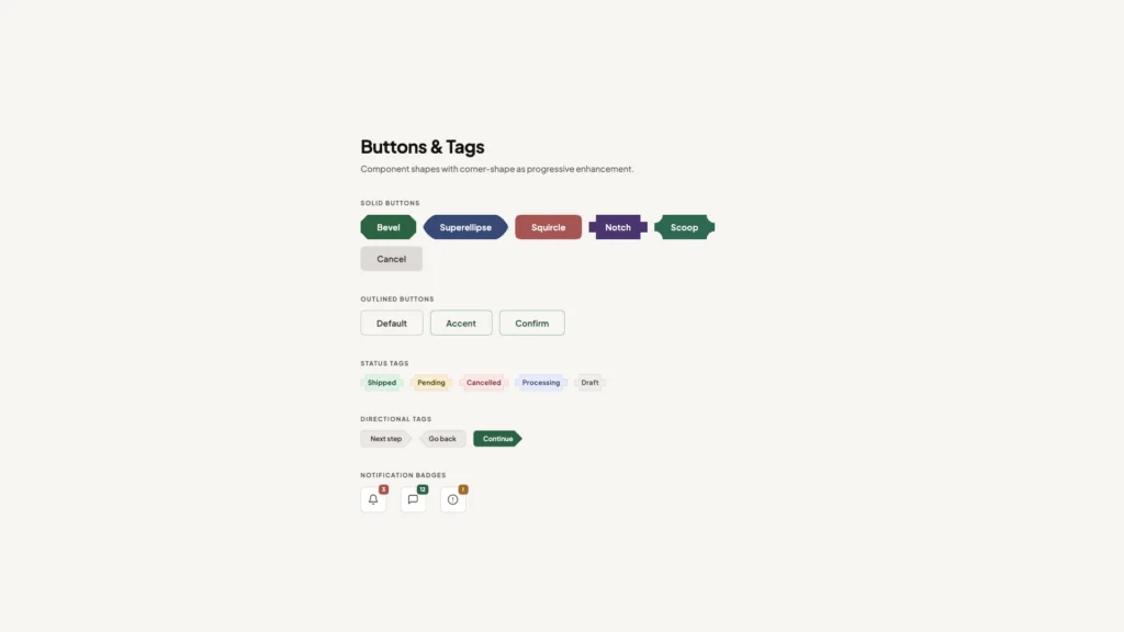
The property offers six keyword values that map to specific superellipse calculations: square (infinity), squircle (2), round (1), bevel (0), scoop (-1), and notch (-infinity). Each represents a distinct corner treatment, from aggressively sharp inset corners (notch) to perfectly squared outset corners (square). The squircle, in particular, has gained attention for its Apple-esque aesthetic—that distinctive not-quite-round, not-quite-square shape that feels more organic than a standard rounded rectangle.
The Technical Implementation
The demo implementation reveals some clever techniques worth examining. The animation uses a pseudo-element (body::before) positioned as a fixed overlay covering the entire viewport. This approach keeps the animated shape separate from content, which is critical for performance—you're animating a single element rather than affecting layout or triggering reflows.
The pointer-events: none declaration is essential here. Without it, the overlay would block all interaction with underlying content. This single line makes the animation purely visual, allowing users to click, scroll, and interact normally while the shape morphs around them.
The color treatment uses mix-blend-mode: difference with a white background, creating an inversion effect that's become trendy in modern web design. This isn't just aesthetic—it's a practical solution for maintaining visibility across varied background colors. However, the implementation includes an important escape hatch: an isolation: isolate utility class that prevents the blend mode from affecting specific elements like cards or images where color accuracy matters.
Understanding the Border-Radius Relationship
Here's something that might surprise you: border-radius doesn't actually round corners. It defines the x-axis and y-axis coordinates that determine where the corner effect should be drawn. The actual rounding happens because corner-shape: round is applied by default under the hood.
This distinction becomes important when you're working with corner-shape animations. You need border-radius to establish the coordinate space (in this case, border-bottom-left-radius: 100% pushes those coordinates to the opposite end of their axes), but then you override the default rounding behavior with your custom superellipse values in the keyframe animation.
The animation itself requires no duration specification because animation-timeline: scroll() establishes scroll position as the timeline. As the user scrolls, the animation progresses proportionally. This creates an inherently responsive experience—fast scrollers see rapid transitions, while slow scrollers can appreciate the gradual morphing of the shape.
Refinement Through Iteration
The initial implementation had a subtle but noticeable flaw: the animation felt constrained and harsh at its extremes. When animating from notch (superellipse(-infinity)) to square (superellipse(infinity)), the curvature appeared too aggressive at the start and end points, and the shape seemed to get sucked into the corners.
The solution involved two adjustments. First, extending the shape beyond the viewport boundaries by changing inset: 0 to inset: -1rem. This gives the animation breathing room and prevents that claustrophobic feeling. Second, using more moderate superellipse values—superellipse(-6) to superellipse(6) instead of the infinity extremes. This ensures smoother transitions while keeping the most extreme portions of the animation outside the visible viewport.
This kind of refinement is typical in animation work. The mathematical correctness of animating from -infinity to infinity doesn't necessarily produce the most visually pleasing result. Sometimes you need to constrain the range to match human perception and aesthetic preferences.
Browser Support and Progressive Enhancement
The elephant in the room is browser support. This technique currently requires Chrome 139+, which limits its immediate practical application. However, this is exactly the kind of enhancement that works well with progressive enhancement strategies. The effect is purely decorative—your content remains fully accessible and functional without it.
For production use, you'd want to wrap this in a feature query and provide a graceful fallback. Users on unsupported browsers simply wouldn't see the animated shape, but they'd lose nothing in terms of functionality or content access. As Firefox implements scroll-driven animations through Interop 2026 and corner-shape support expands, the technique will become more broadly applicable.
Performance Considerations
One significant advantage of this approach is performance. Scroll-driven animations run on the compositor thread when possible, meaning they can achieve 60fps even on modest hardware. You're not running JavaScript on every scroll event, calculating positions, and updating styles. The browser handles the interpolation natively, which is always going to be more efficient than userland code.
The use of a single pseudo-element also minimizes the performance impact. You're animating one shape property on one element. There's no cascade of layout changes, no repainting of content, no complex stacking context issues. This is about as lightweight as a visual effect can be while still creating significant visual interest.
Where This Technique Fits
This isn't a solution looking for a problem—it's a tool for specific use cases. Landing pages, portfolio sites, and marketing pages are natural fits. Anywhere you want to create visual interest and guide the user's attention as they scroll, this technique offers a modern, performant option.
The key is restraint. An animated shape morphing across the entire viewport is a strong visual statement. It works best when the rest of your design is relatively minimal, allowing the animation to be a focal point rather than competing with other elements. The demo's use of cards with the isolation utility class shows one approach: let the animation affect the background and negative space while keeping content areas stable and readable.
As these CSS features gain broader support, we'll likely see developers push them in unexpected directions—combining multiple corner-shape animations, creating more complex scroll-driven sequences, or integrating them with view transitions and other modern CSS capabilities. The foundation is solid, and the creative possibilities are just beginning to be explored.
CSS has quietly become a powerhouse for creating sophisticated visual effects without JavaScript, and the intersection of scroll-driven animations with the new `corner-shape` property represents one of the most exciting developments in modern web design. While many developers are familiar with basic scroll effects, few have explored how these two features combine to create dynamic, performant interfaces that respond naturally to user interaction.
The Technical Foundation: How Scroll-Driven Animations Work
Scroll-driven animations fundamentally change how we think about triggering visual changes on the web. Unlike traditional time-based animations that play automatically, scroll-driven animations tie their progress directly to the scroll position. This creates a 1:1 relationship between user input and visual feedback, making interfaces feel more responsive and intentional.
The `animation-timeline: scroll()` property is the key mechanism here. It replaces the default time-based timeline with a scroll-based one, meaning your animation progresses as the user scrolls rather than as time passes. This approach offers several advantages: it's declarative (no JavaScript event listeners needed), it's performant (browsers can optimize scroll-linked effects), and it's accessible (respects user motion preferences automatically).
What makes this particularly powerful is the seamless integration with existing CSS features. Scroll snapping, for instance, can be added with just a few lines of code. Setting `scroll-snap-type: y` on the root element and `scroll-snap-align: start` on sections creates natural stopping points that work in harmony with your animations, not against them.
Understanding corner-shape: Beyond Simple Border Radius
`corner-shape` is a relatively new CSS property that extends far beyond what `border-radius` can achieve. While `border-radius` creates circular or elliptical corners, `corner-shape` introduces geometric primitives like `notch`, `bevel`, `scoop`, and `angle`, plus the mathematically sophisticated `superellipse()` function.
The superellipse deserves special attention. It's a mathematical curve that sits between a rectangle and an ellipse, controlled by an exponent parameter. When you animate from one `superellipse()` value to another, you're creating smooth morphing effects that would require complex SVG manipulation or canvas drawing in the past. Now it's just CSS.
Practical Implementation: The Masking Technique
One of the most creative applications involves using `corner-shape` as a masking layer. By creating a notched shape that matches the background color and positioning it over a border, you can reveal that border progressively as the user scrolls. The technique relies on careful z-index management and the `inherit` keyword for backgrounds.
The rotation trick adds another dimension. Applying `rotate: 5deg` to the masking shape creates asymmetric reveals that feel more dynamic than straight geometric transitions. This is where understanding the stacking context becomes crucial—your content needs `position: relative` and `z-index: 1` to sit above the decorative layers.
When animating `border-radius` in this context, the dual-axis syntax (`20vw / 20vh`) becomes important. The first value controls horizontal corner radius, the second controls vertical. Using viewport units ensures the effect scales proportionally across different screen sizes, maintaining visual consistency.
Performance Considerations and Browser Support
Scroll-driven animations are compositor-friendly, meaning they can run on the GPU without blocking the main thread. This is a significant advantage over JavaScript-based scroll listeners, which can cause jank if not carefully throttled. However, `corner-shape` itself is still gaining browser support—as of early 2025, it's primarily available in Chromium-based browsers behind flags.
For production use, this means implementing progressive enhancement. Your base design should work without `corner-shape`, with the animated effects serving as an enhancement for supporting browsers. Feature detection with `@supports (corner-shape: bevel)` lets you apply these effects conditionally.
Multi-Element Choreography
The nested diamond example demonstrates how multiple elements can share the same animation timeline while creating complex visual patterns. Ten nested divs, each with `corner-shape: bevel` and `border-radius: 100%`, animate their padding in unison. The result is a kaleidoscopic effect where geometric shapes expand outward as you scroll.
This approach is more efficient than it appears. Because all elements reference the same `@keyframes` rule and timeline, the browser only needs to calculate the scroll position once and apply it to multiple elements. The fixed positioning keeps them out of the document flow, preventing layout thrashing.
Integration With Modern Scroll APIs
These CSS animations work alongside JavaScript scroll methods without conflict. Calling `scrollTo()`, `scrollBy()`, or `scrollIntoView()` will trigger the animations just as manual scrolling would. This means you can programmatically control scroll position—perhaps in response to button clicks or keyboard navigation—and the visual effects follow naturally.
Text fragments (the `#:~:text=` URL syntax) also work seamlessly. When a user lands on your page via a text fragment link, the browser scrolls to that content and your animations reflect that scroll position immediately. This kind of interoperability is what makes CSS-based solutions so robust.
Where This Technology Is Heading
The combination of scroll-driven animations and advanced shape properties points toward a future where complex, app-like interfaces are built entirely in CSS. We're seeing the language evolve from styling static documents to orchestrating dynamic experiences that rival what was previously only possible with heavy JavaScript frameworks.
As browser support solidifies, expect to see these techniques in production sites—particularly for marketing pages, portfolios, and editorial content where visual impact matters. The key will be using them purposefully rather than decoratively, ensuring that animations enhance comprehension rather than distract from content. The best implementations will be those where users barely notice the technique but feel the improved experience.
You Might Also Like

I've Tested Portable Power Stations for Years — Here's What I'd Actually Buy in the Last Hours of the Amazon Big Spring Sale
What's !important #8: Light/Dark Favicons, @mixin, object-view-box, and More
