CSS Wrapped 2025: Mastering State Management, Logic, and Native Browser Capabilities
The web platform has reached an inflection point. We're no longer asking for rounded corners or gradient backgrounds—those battles were won a decade ago. What's happening now cuts deeper: CSS is absorbing capabilities that previously required JavaScript libraries, build tools, and architectural compromises. Chrome's "CSS Wrapped 2025" report isn't just a feature list; it's evidence of a fundamental power shift in how we build interfaces.
Having tracked CSS evolution through multiple phases—from the early days of flexbox adoption to what I've termed the "CSS5 era"—I can say this year represents something different. The features landing in browsers aren't incremental improvements. They're solving problems that have plagued web development since the beginning, problems so entrenched that entire industries grew up around working around them.
The Select Element: A Twenty-Year Problem Finally Solved
The humble dropdown menu has been web development's most stubborn pain point. For two decades, styling a select element meant choosing between ugly native controls or pulling in JavaScript libraries that recreated the entire component from scratch. This wasn't just an aesthetic issue—it was an accessibility minefield and a performance tax that every form paid.
The new `appearance: base-select` property changes everything. By allowing full CSS customization of the native `
What makes this particularly powerful is the `
The technical debt reduction here is massive. Every form library, every custom dropdown component, every accessibility workaround—all of that code can eventually be deleted. For teams maintaining large codebases, this represents thousands of lines of JavaScript that can simply disappear.
Carousels Without JavaScript: The End of an Era
Carousels occupy a unique space in web development culture: clients love them, developers hate building them. The tension isn't about the visual design—it's about the JavaScript required to make them accessible, performant, and maintainable. That tension just evaporated.
The `::scroll-marker` and `::scroll-button()` pseudo-elements deliver fully functional, accessible sliders with zero JavaScript. Navigation dots link natively to scroll containers. Buttons work out of the box. The `scroll-marker-group` property automatically creates the container for pagination dots, while anchor positioning lets you place controls exactly where you need them.
This isn't just about convenience—it's about performance. JavaScript-based carousels carry overhead: event listeners, state management, animation loops, intersection observers. A CSS-only carousel eliminates all of that. The browser handles scrolling natively, which means better performance on low-end devices and smoother animations across the board.
There are legitimate accessibility concerns that need addressing, particularly around keyboard navigation and screen reader announcements. But the foundation is solid, and the path forward is clearer than the previous approach of manually managing ARIA attributes and focus states across custom DOM structures.
I built a webshop-style slider that uses the `attr()` function to pull background images dynamically into markers. The entire implementation—layout, navigation, active states—is pure CSS. Six months ago, this would have required a library like Swiper or Slick, plus custom JavaScript for the thumbnail navigation.
State Queries: Knowing What's Actually Happening
One of CSS's historical blind spots has been state awareness. Is that sticky header actually stuck to the viewport? Which item in a scroll container is currently snapped? These questions seem basic, but answering them required JavaScript observers and manual state tracking.
Scroll-state queries solve this declaratively. Set `container-type: scroll-state` on a container, and you can query whether children are stuck, snapped, or overflowing. You can even detect scroll direction. This is the kind of feature that seems minor until you realize how many times you've written IntersectionObserver code to achieve the same thing.
The practical applications are immediate. A sticky header that only shows a shadow when actually stuck to the top—no more shadows appearing prematurely or lingering after scroll. A carousel that highlights the active slide based on snap position, not JavaScript state. A list that applies different styles based on overflow state.
I built a Pokémon character selector that combines scroll-state queries with anchor positioning to move a frame over the currently snapped character. The entire interaction—scroll, snap detection, frame positioning—happens in CSS. The code is declarative, the performance is native, and the maintenance burden is minimal.
Logic Enters the Stylesheet
CSS has always had a logic problem. We could describe what we wanted, but we couldn't express conditional reasoning without splitting code across multiple rule blocks. The "Optimized Ergonomics" features in this year's report change that fundamental limitation.
The `if()` function brings ternary-style conditionals to CSS. Instead of writing separate media query blocks for single property changes, you can now write inline conditions. This might seem like syntactic sugar, but it fundamentally changes how we structure stylesheets. Logic stays close to the properties it affects, making code easier to read and maintain.
The `@function` directive lets us extract reusable logic into named functions, bringing proper abstraction to CSS. Combined with `sibling-index()` and `sibling-count()`, we can now write mathematical formulas that respond to DOM structure without hardcoding values.
Consider animation staggering. Previously, you'd either hardcode custom properties in HTML (`style="--index: 1"`) or use JavaScript to inject them. Now you can write `animation-delay: calc(sibling-index() * 0.1s)` and it just works. The animation delay automatically adjusts based on each element's position in the DOM.
I experimented with using these functions alongside trigonometry to place items in a perfect circle. The calculation—determining each item's angle based on its index and the total count—happens entirely in CSS. No JavaScript, no build step, no manual calculations. The code is declarative, the layout is dynamic, and adding or removing items requires no code changes.
What This Means for How We Build
These features share a common thread: they move complexity from userland to the platform. Every custom select library, every carousel plugin, every scroll observer—these represent solutions to problems the platform should have solved years ago. Now it's finally happening.
The implications extend beyond individual features. When the platform handles common patterns natively, we can delete code. Less code means fewer bugs, smaller bundles, faster load times, and reduced maintenance burden. It means junior developers can build complex interfaces without mastering JavaScript frameworks. It means accessibility becomes easier because native controls handle it by default.
There's also a philosophical shift happening. For years, the web platform felt like it was playing catch-up with native apps. These features suggest a different future: one where the web's declarative nature becomes an advantage, not a limitation. CSS is absorbing capabilities that make sense in a stylesheet, leaving JavaScript to handle actual application logic.
The transition won't be instant. Browser support takes time, legacy codebases need maintenance, and some features still have rough edges. But the direction is clear. We're moving toward a web where the platform does more of the heavy lifting, where CSS handles presentation concerns natively, and where JavaScript can focus on what it does best: managing state and handling complex interactions.
The Features Still on My List
While I've been deep in select elements and scroll states, the CSS Wrapped report includes features I haven't fully explored yet. Anchored container queries stand out—the ability to query an anchor element's dimensions opens up new layout possibilities that I'm eager to test. The combination of anchor positioning with container queries could solve responsive design problems that currently require JavaScript or awkward workarounds.
What excites me most isn't any single feature—it's the velocity. The pace of CSS evolution has accelerated dramatically. Features that seemed years away are landing in stable browsers. The gap between proposal and implementation is shrinking. We're in a moment where keeping up with the platform requires constant experimentation, where last year's impossible becomes this year's demo, and where the question isn't whether CSS can do something, but whether we've learned how yet.
The CSS specification has reached an inflection point. After years of incremental improvements, we're seeing features that fundamentally change what's possible without JavaScript. Chrome's latest CSS Wrapped showcase reveals capabilities that would have seemed impossible just two years ago—and more importantly, they solve real problems developers face daily.
The Tooltip Problem Finally Gets a Native Solution
Anyone who's built a tooltip system knows the frustration: you position it above an element, but when it's near the viewport edge, the browser flips it below. Your carefully crafted arrow still points upward, now awkwardly jutting into empty space. The fix has always required JavaScript to detect the flip and adjust styling accordingly.
Anchored Container Queries eliminate this entire class of problems. The new @container anchored(fallback: flip-block) syntax lets you query which fallback position the browser actually selected. When CSS Anchor Positioning automatically repositions your tooltip, your styles can respond to that decision natively. The arrow rotates, padding adjusts, shadows flip—all without a single event listener.
This matters beyond tooltips. Dropdown menus, popovers, and contextual panels all share this positioning challenge. What's significant here is the pattern: CSS is gaining the ability to respond to its own layout decisions, creating a feedback loop that previously required JavaScript to close.
View Transitions Gain the Dimension They Were Missing
View Transitions launched with impressive capabilities but a critical limitation: they flattened the rendering tree. Elements got hoisted to the document root during transitions, which broke any parent-child relationships that mattered for rendering. If you had a card with overflow: clip containing an image, that clipping disappeared mid-transition. 3D transforms lost their perspective context entirely.
The workarounds were painful. Developers either avoided these visual patterns or accepted jarring moments when clipping suddenly failed. Some resorted to elaborate JavaScript choreography to hide the problem.
Nested View Transition Groups change the calculus. By setting view-transition-group: nearest, elements maintain their position in the rendering hierarchy. A rotated card stays within its 3D transform context. An image respects its container's clipping boundaries throughout the animation. The code is remarkably simple—a single property value—but the implications are substantial. Complex UI patterns that seemed incompatible with View Transitions become straightforward.
Typography Gets Surgical Precision
Text rendering has carried typographic baggage from the print era: leading space above and below glyphs that made sense for line spacing but creates alignment headaches in UI design. Centering text vertically in a button requires either magic numbers or accepting "close enough." Icon-text alignment involves trial and error with fractional pixels.
Text Box Trim targets this specific pain point by removing the leading space, letting you align to the actual visual bounds of the letterforms. This isn't about aesthetics—it's about predictability. When you set vertical padding, you get that exact amount of space, not that amount plus whatever leading your font includes. Design systems can finally specify spacing that works consistently across different typefaces.
The practical impact shows up in component libraries. Button heights become more consistent. Badge alignment stops requiring per-font adjustments. Vertical rhythm systems work as intended without compensatory margins scattered throughout the codebase.
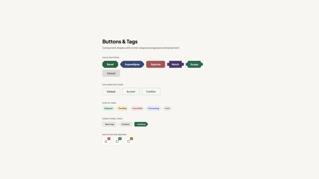
Beyond Rectangles Without the Complexity Tax
Web layouts have been fundamentally rectangular since the beginning. Border-radius softened the corners, but the underlying box model remained. Designers have long wanted "squircles"—those iOS-style rounded shapes that feel more organic than simple rounded corners—but achieving them meant SVG masks, canvas rendering, or accepting performance penalties.
The new corner-shape property and shape() function make non-rectangular layouts a first-class CSS capability. More importantly, these shapes can respond to CSS variables, meaning they can adapt to different screen sizes, user preferences, or component states without regenerating assets. A card that morphs its corner curvature based on viewport width becomes a few lines of CSS rather than a JavaScript-driven animation system.
This opens design possibilities that were technically feasible but practically prohibitive. When the implementation cost drops, designers explore more freely. Expect to see interfaces that break the rectangular grid in subtle, purposeful ways rather than the uniform boxes that currently dominate.
The JavaScript Boundary Keeps Shifting
These features share a common thread: they're absorbing functionality that previously required JavaScript. The moveBefore method preserves DOM state when reordering elements—critical for iframes and video players that reset when moved in the tree. The enhanced attr() function now handles typed values, letting you pull colors or grid dimensions directly from HTML attributes into CSS calculations.
This isn't about replacing JavaScript entirely. It's about moving declarative concerns back into the declarative layer. When CSS can handle state-dependent styling, positioning logic, and layout responses natively, JavaScript can focus on actual application logic rather than bridging gaps in the styling system.
The performance implications matter too. Browser engines can optimize CSS in ways that JavaScript never allows. A pure-CSS solution for tooltip positioning runs on the compositor thread, avoiding main thread congestion. View Transitions handled natively can leverage GPU acceleration more effectively than JavaScript-driven alternatives.
The Browser Fragmentation Question
Most of these features currently live in Chrome, which raises the familiar concern about browser-specific development. The web's strength has always been its cross-platform consistency, and Chrome-first features threaten that foundation.
However, the Interop initiative provides reason for optimism. When browser vendors agree on priorities, features move from experimental to baseline remarkably quickly. The key is ensuring these capabilities get discussed, tested, and refined before they calcify into standards. Early experimentation in one browser, followed by collaborative standardization, has proven more effective than trying to achieve consensus before implementation.
Developers should engage with these features now—not necessarily in production, but in side projects and prototypes. The feedback loop between implementation and specification needs real-world usage to identify edge cases and API improvements. The features that make it to baseline will be better for having been stress-tested early.
What This Means for How We Build
The shift toward CSS handling more complex interactions changes architectural decisions. Component libraries can reduce their JavaScript footprint. Design systems can specify behaviors that were previously implementation details left to developers. The gap between design tools and production code narrows when CSS can express more of what designers envision.
For teams, this suggests revisiting assumptions about what belongs in CSS versus JavaScript. That tooltip system you built two years ago? It might be simpler and more performant as pure CSS now. The animation library you're considering? Check whether native CSS features cover your use cases first.
We're entering a period where CSS literacy becomes more valuable. Understanding these new capabilities—when to use them, how they compose, what their performance characteristics are—will differentiate developers who can build efficient, maintainable interfaces from those still reaching for JavaScript by default. The toolkit has expanded dramatically. Learning to use it well is the next challenge.
You Might Also Like

I've Tested Portable Power Stations for Years — Here's What I'd Actually Buy in the Last Hours of the Amazon Big Spring Sale
What's !important #8: Light/Dark Favicons, @mixin, object-view-box, and More
